The Sorting Hat - Hack Week 2022
Role: UX Writer
Timeline: One week
Tools: Figma, Google Workspace
Team: Product Design, Engineering, Communications, Marketing
Idea: For Hack Week 2022, what if we took users’ listening history and sorted them into their Hogwarts House?
Outcome: We delivered a visual prototype of the in-app experience and a back-end workaround to sort Hack Fair attendees. We were runners-up for Best Non-Technical Hack!
Prep
Before we could sort users, we had to sort the music.
Each team member compiled a House playlist (here’s mine!). Based on the characteristics we saw in the playlists, we narrowed our scope to four measurable attributes:
Acousticness - The track is acoustic (e.g., piano or acoustic guitar) as opposed to electric or electronic.
Tempo - The beats per minute on the track.
Energy - A perceptual measure of intensity and activity throughout the track. For example, a high energy track is fast and loud.
Valence - The mood of the track. A track with high valence is cheerful and upbeat.
Each attribute could have a value between 0-1 (with the exception of Tempo, which was 0-250), so we broke them down in increments of .25. Here’s how we ranked each House, with the highest values on top:
Energy
Gryffindor
Slytherin
Ravenclaw
Hufflepuff
Valence
Hufflepuff
Gryffindor
Ravenclaw
Slytherin
Acousticness
Hufflepuff
Ravenclaw
Gryffindor
Slytherin
Tempo
Gryffindor
Hufflepuff
Ravenclaw
Slytherin
Development
Our designer used flows from previous playlist generators, so we got to reuse some button and header copy—but it was up to me to Potterize it.
There were two things we needed to communicate:
This is a custom Hogwarts House playlist
The sorting is based on your musical taste, not your personality
Here are my initial entry point drafts:
❌
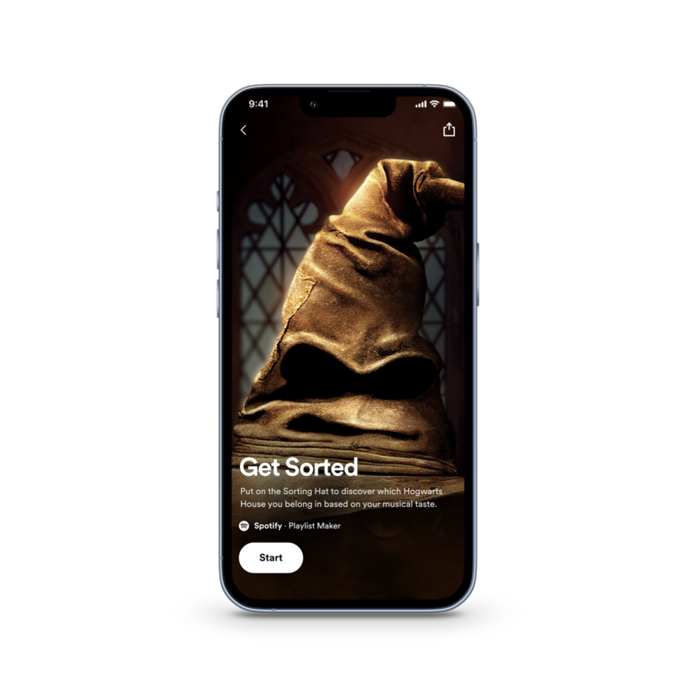
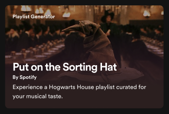
We liked the Sorting Hat image here, so I wanted the action to be related to it. But it wasn’t a strong enough call to action.
✅
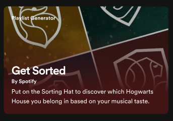
This had a clearer action for the user to take—and we still got to recycle the “put on the hat” line.
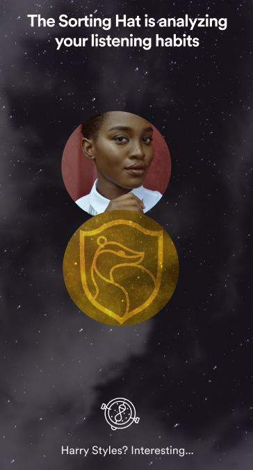
In the Sorting interaction, the designer wanted to have two animations:
Flipping the user’s profile photo between the House icons
A spinning Time Turner as a loading symbol
In Harry Potter, the Sorting Hat provides commentary while sorting students, so I needed to give the hat a voice. Our prototype was going to be for Gryffindor, so I took the attributes we defined and wrote a few musings to cycle through:
Let me think.
Hmm… Quite bold…
Very up-tempo…
Harry Styles? Interesting…
I know just where you belong!
In a live interaction, these would be dynamic text that we’d customize based on the user’s listening habits.
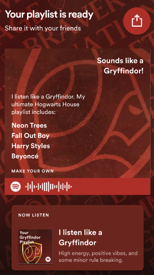
The results page recycled copy from another campaign—specifically the “playlist is ready” and “share” content. But we needed to define how we were wording the results.
Harry Potter fans are passionate about their House allegiance! I didn’t want to be responsible for an identity crisis.
I felt the Sorting Hat’s voice was better represented in the loading screen, and that this should be more Spotify—and that we needed to reiterate that the results were all about the music.
I tried a couple phrases for the “Sounds like a Gryffindor!” field:
I’m a… - The person was too connected to the result
Streams like a… - This wasn’t personal enough
“Sounds like a Gryffindor!” sounded like an exclamation that could come from the Sorting Hat, and tied us back to the analysis of the user’s listening habits.
I was also able to repurpose “Streams like a…” into the share description.
One team member really liked the alliteration of “I stream like a Slytherin,” but since listening is everything at Spotify, I decided to keep all four Houses consistent.
The House playlists
Even though we were prototyping the Gryffindor experience, I wanted to write descriptions for all four House playlists.
Everyone on the team collected quotes about the Houses and added personality attributes to a Google spreadsheet. We discussed how we could incorporate these traits. I wanted to find ways to tie these personality traits to directly to the music using the exploration we’d already done.
I tried to find a balance between including terms and phrases Potter fans would recognize, while also keeping them readable for the most casual fans. These would be a challenge to localize in their current state! But Harry Potter has been translated into over 75 languages, so I’m confident these could be localized while keeping the magic.

“Bold beats, positive vibes, and some minor rule breaking.”

“Easy-going acoustics and unyielding optimism.”

“Clever lyrics and creativity beyond measure.”
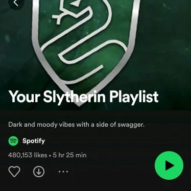
“Dark and moody vibes with a side of swagger.”
What I’d do differently today
Be confident
This was my first official UX writing project, and I quickly learned that most of the team had never worked with a content designer. It was a new for all of us!
There were some blurred lines about copy ownership and direction, and I was never sure when to defer or push back. I’d feel more confident in my contributions if I was kicking off this project today.
Change the past
There was some old copy I’m not trilled with that we carried over from previous campaigns. I didn’t even draft changes for them because I thought they were standardized! I’d love to see those trimmed down.
Prioritize localization
I wasn’t thinking about localization when I wrote the playlist descriptions—just about how to include the most relevant musical Hogwarts House references.
I’d try to find more plain language descriptors if I was reworking them now.