Role: UX Writer
Timeline: 2 weeks
Tools: Figma, Google Workspace
Team: Product Design, Legal
Problem: An A/B test needed on-brand copy to encourage Premium customers to try certain features.
Outcome: I delivered copy for three Home shelf modals, and an instructional modal for one of the features.
Prep
Sometimes we don’t get brought into the process until late in the game—but we can still provide valuable insights!
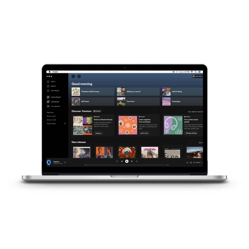
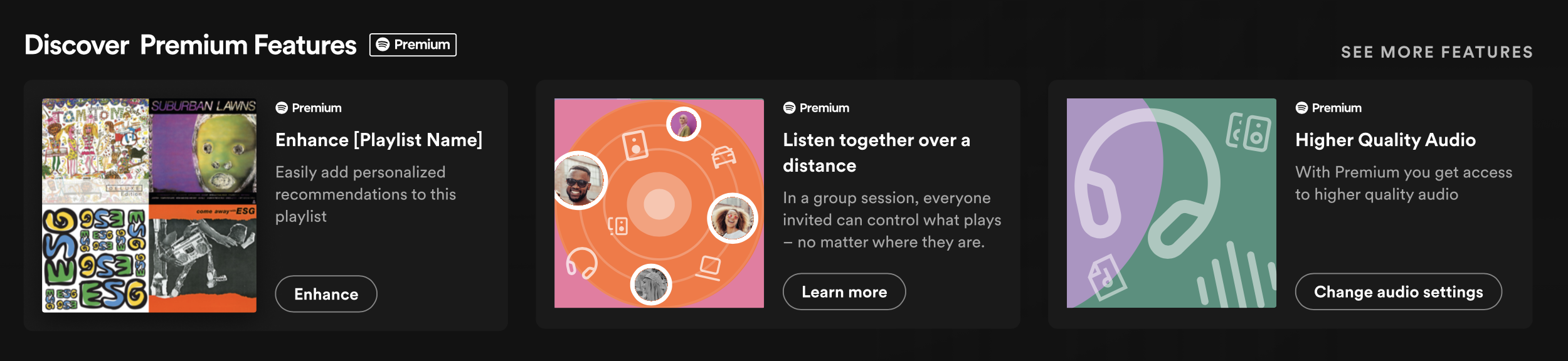
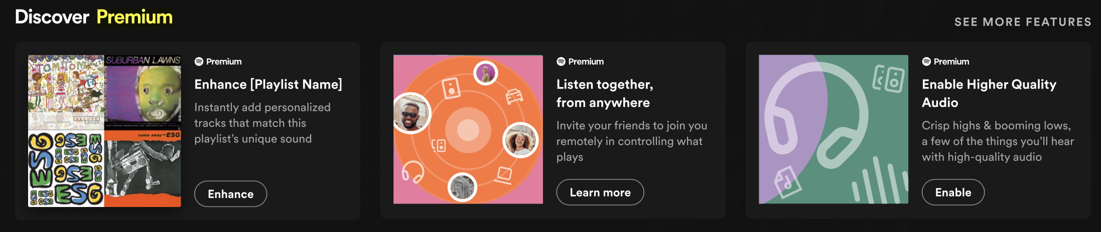
There were three features included in the test: Enhance, Group Sessions, and High Quality Audio. The goal of the test was to encourage users to try out these features to drive adoption by Premium subscribers. Which posed an interesting question: How do we essentially upsell something someone is already paying for?
The copy when it landed on my desk!
There was also the challenge that these features each have their own contextual use case, so there was nothing to unify them other than their state of being. Let’s define those states here so you know what we’re working with:
Enhance: Adds (and removes!) song recommendations to playlists. Available on desktop and mobile.
Group session: Lets multiple people control the queue from anywhere. Only available on mobile—and this is a desktop-exclusive A/B test!
Higher quality audio: Not so much an app feature as much as a setting you turn adjust and then forget.
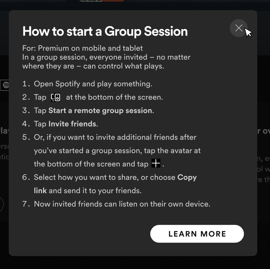
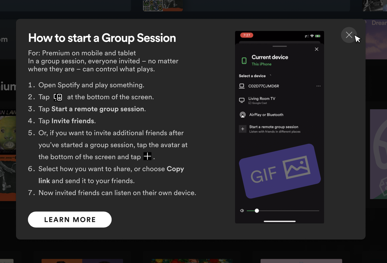
Because group sessions are mobile-only, the product team had three test options for where that Learn more button would lead. They were:
A text-only instructional pop-up modal
A text-and-gif instructional pop-up modal
No modal—just a link to the Spotify Support site article about group sessions
Here’s what those first two looked like at that stage:
Drafts
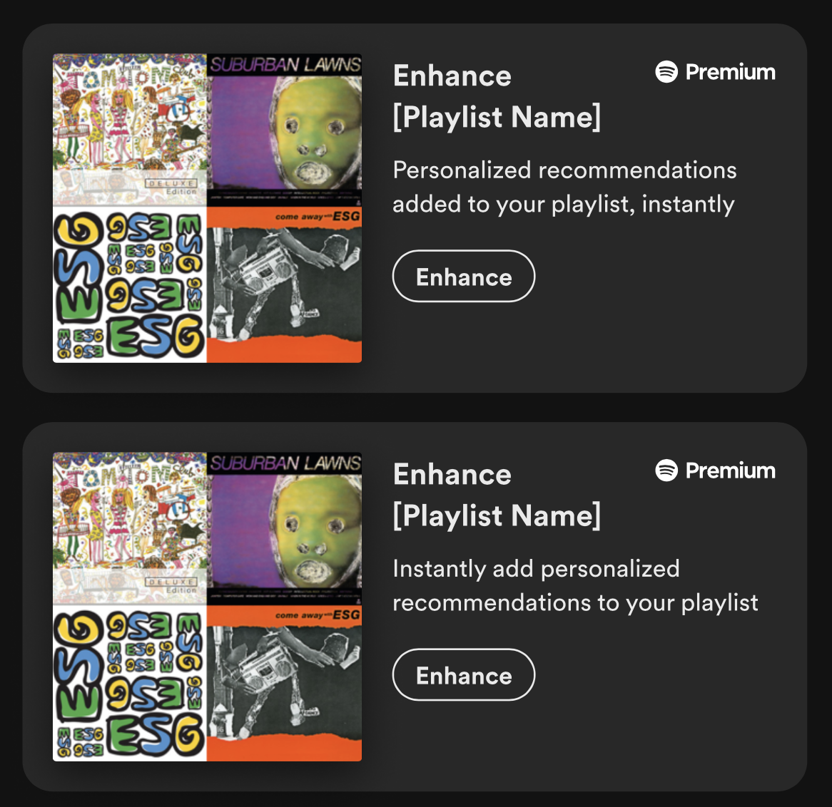
Enhance
My first two drafts were a little more editor than writer!
I didn’t change much from the original, but I thought about what might deter someone from using the feature: a fear that it might mess up the vibe.
So in this draft, I wanted to focus on the speed of the Enhance feature—in the hopes that it would tell people it was also that easy to unenhance.
The feedback on these two drafts was that they were okay, but it’d be great to put more focus on:
Explicitly addressing that fear that clicking the button will destroy your playlist
It will only add recommendations to this specific playlist
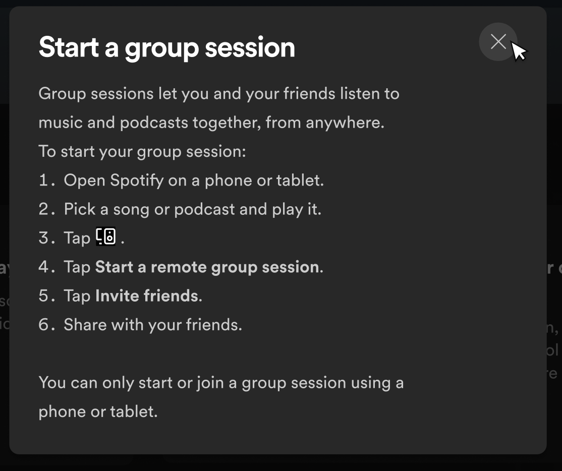
Group session
The pop-up modal here was pre-populated with a support site article from our Customer Service team, which you can see above.
I wanted it to be hyper skimmable so a customer wouldn’t see the instructions and close out due to the complexity!
I also recommended removing the link to the support site from the modal, as it would’ve repeated the same information at the site.
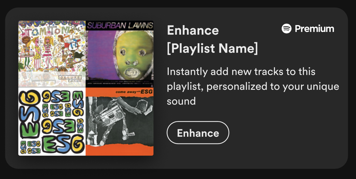
Final:
Final
Final: