Role: Instructional Designer, UX Writer
Timeline: 48 hours
Tools: Figma, Google Workspace
Team: Engineering, Internal Tools, CS Training
Problem: To use the Jira widget, advisors needed to log in and then refresh the widget. I was asked to build a training for this behavior.
Outcome: In lieu of a training, I suggested a few UX changes to make the actions clearer in context.
Prep
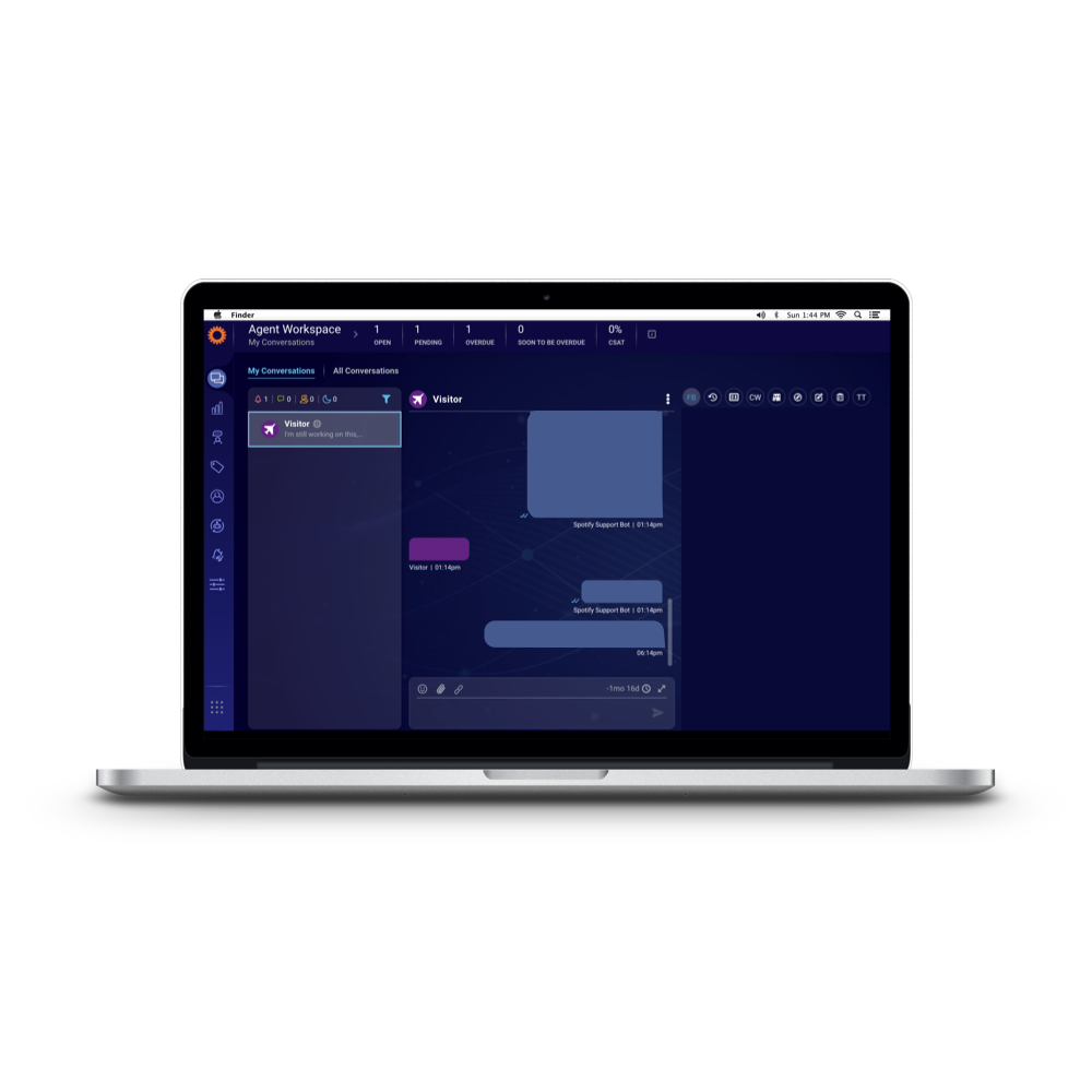
Our advisors use LivePerson to communicate with customers. There are a variety of widgets in the tool to help advisors increase their efficiency—pre-written content, customer information, and more.
The internal tools team built a JIRA widget that would allow advisors to tag internal escalations with the case number without leaving LivePerson. They submitted a training request to my team, seeking a 10-15 minute training that covered:
Logging in
Refreshing the widget after logging in
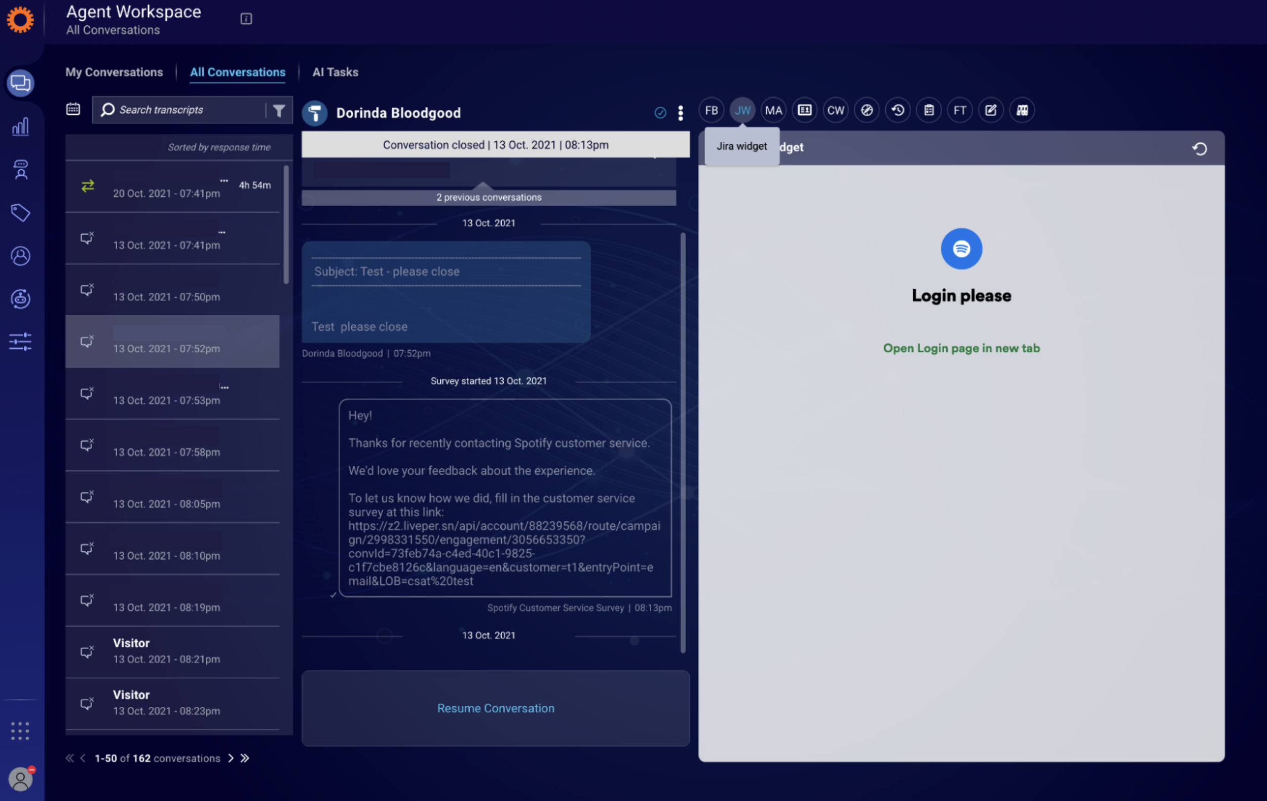
The widget required refreshing due to the login process: Clicking the link opened a new tab, which logged advisors in automatically through single sign-on (SSO). Once advisors closed that window, the widget stayed on the original screen until refreshed.
This was the state of the widget at the time:
I wondered if there was a way we could simplify this process in context—without training.
Development
I chatted with my manager, explaining that I wanted to push back on the need for a full training. Why? Because the expected behavior should be as close to its “point of use” as possible! This wasn’t an incredibly common action that advisors performed daily—it was a weekly or monthly task, at best. Would advisors visit the training repeatedly for a reminder? Unlikely. But if the directions were in the tool itself…
We were working asynchronously, so I sent a couple suggestions:
I think it's intuitive for them to use, with the exception of refreshing the widget after logging in. I think this might be fixable with an update to the copy in the widget.
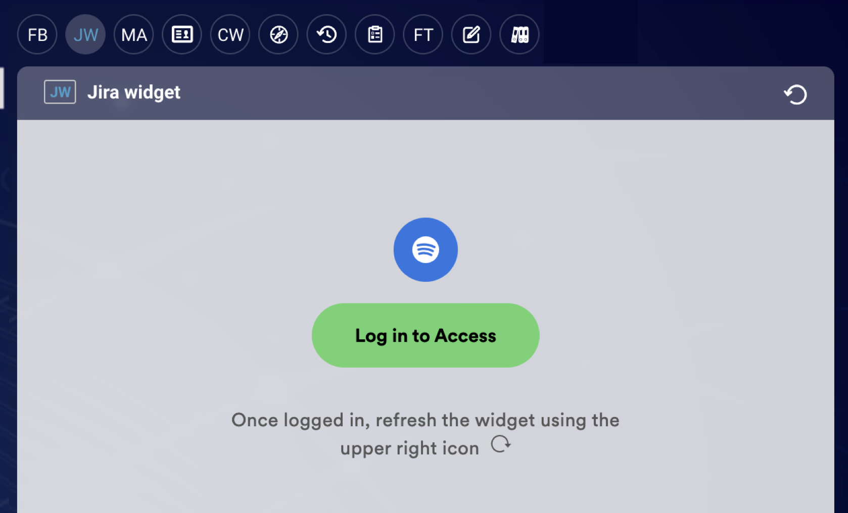
My suggestion is for the call to action to be on top ("Log In to Access" or "Log In for Access" as a login link, replacing "Login please") and then for a note below that to say "Once logged in, refresh the widget using the upper right icon." Or—if there are character restraints—just "Once logged in, refresh widget" (I have concern about them refreshing the whole page, but I'll defer to what's doable!).
They were able to implement this without any issues, which meant we didn’t need to create the training! We announced the rollout of the widget in our knowledge base and customer support newsletter.
This small change saved over 330 production hours across our global advisor base.
What I’d do differently today
Check the style guide
My team uses title case, but the official Spotify style guide does not (whoops!). If I was writing this today, I’d use sentence case instead to match the brand.
Consider directional copy
I’m usually well-versed in accessibility best practices, but I’d never been advised against directional copy.
While I might reconsider it here, I lean toward keeping it in this context, as it’s not a localized tool, and refreshing the widget within the tool isn’t an intuitive action.
Flip the icon
As in my Sorting Hat example, I was still in the state of “I’m happy to be contributing” and hadn’t found the confidence to push back much. So when they added a backwards refresh icon, I didn’t say anything.
Today, I’d either recommend removing the icon entirely or flipping it so it matches the icon we expect them to click.