Role: Instructional Designer
Timeline: One day
Tools: Storyline
Team: People Practices
Problem: Every Storyline course at MSG opened with the same four unskippable narrated slides — Welcome, Course Intro, Objectives, and Course Navigation — adding 3 to 4 minutes of mandatory listening to the front of every course, regardless of whether a learner needed it.
Outcome: A single interactive intro screen with access to objectives and navigation for those who wanted them, while eliminating mandatory narration time for everyone else. The format was adopted as the standard Storyline intro across the team's in-house eLearning catalog.
Prep
One of the first things I did when I joined MSG was go through the onboarding courses. Because I was a new hire.
My manager had asked me to look at them with a designer's eye — as if I wouldn’t already! — and something jumped out immediately: Every course started the exact. same. way. Welcome slide with narration. Course intro with narration. Objectives with narration. Navigation with narration. Four slides, three to four minutes, none of it skippable.
I did the math for my manager. Our onboarding cohort was 20 people. Seven mandatory courses. Three minutes of intro per course, per person. That's 420 minutes — a full 7-hour workday — paid for in course introduction time alone. For a single cohort! And that's before asking whether anyone needed to hear the navigation instructions for the seventh time.
The Re-design
The solution wasn't to remove the objectives or navigation — that information is genuinely useful for some learners, some of the time. The solution was to stop forcing it on everyone.
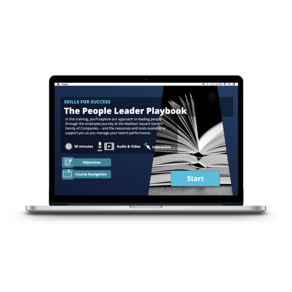
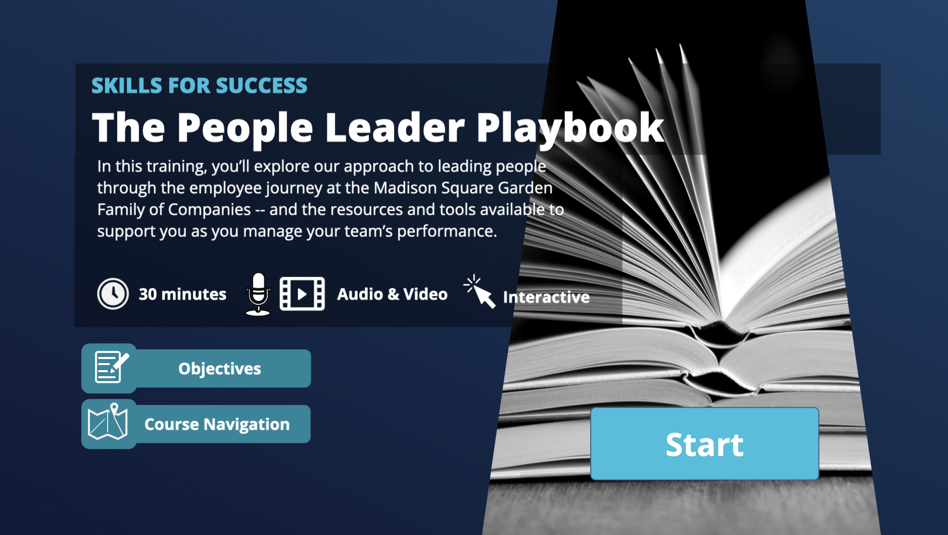
I replaced the four-slide sequence with a single static screen: course title, a brief description, at-a-glance details, and two optional buttons — one for Objectives, one for Course Navigation. Learners who needed that context could access it. Learners who didn't could start immediately.
The change also had an accessibility benefit that wasn't part of the original pitch but mattered just as much: the old format autoplayed narration the moment a course opened, putting the learner immediately behind. The new screen is silent until the learner chooses to engage.
It puts the user in control of their own entry point — which is, arguably, how every course should start.
The format was picked up by the rest of the team and became the standard intro for long-form Storyline eLearning at MSG. Sometimes the best design decision is the one that quietly becomes invisible!
What I’d do differently today…
The background image was meant to be in the shape of a spotlight, as if it was shining down on the button. This choice veered a little too artistic for such a functional screen, and no one ever picked up the “spotlight” motif.
I’d design something closer to a 2/3 design with an image on the right third so the text doesn’t need to be shadowboxed for readability — and also because sometimes it became a chore to find an image that fit in that shape!